[Pile Shabu] Restaurant Brand Image Planning | Restaurant LOGO Design | Brand Design
- stella461
- Dec 8, 2022
- 2 min read
Ending the relationship with the Japanese brand, but we have to keep the original insistence on the ingredients, and start again after changing the name. The original brand is relatively conservative. We hope to change the name and start again, and can develop more diversified.
Taken from the idiom "Zhuang Xuan and luxuriant", the zhuang character has a solid foundation and means prosperity and prosperity. The dismantling of the wooden character also has the metaphor of trees and flowers, which is in line with the flagship park and store decoration.
Our "meat" + "soup" + "sauce" has always been the essence of us. Each meat has been selected many times and the thickness of the meat has been tested to adjust to the best state of shabu-shabu. Let the customers who love meat can consume at the middle price, but enjoy the best meat.
Joseph's design here is based on the idea of the name of the pile is the restaurant logo design concept, to plan the simple version of the CIS basic identification of the two design models
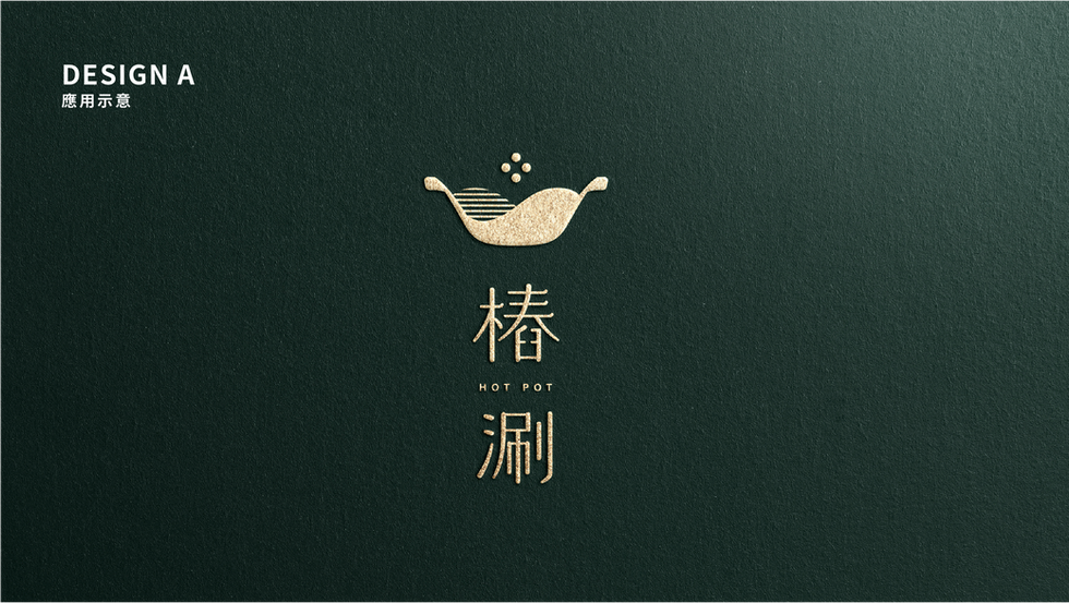
DESIGN A design concept
Recognize the image of pot + mortar as the main body and intuitively connect the pot object, and present the new Taiwan style with simple design. With the image of the hot and flowing soup base, it expresses the vividness of "shabu", and adds the details of the lines of the mortar and wood. The standard word part extends the streamlined arc design, and the four dots embellished above identify the various ingredients of the hot pot, making the identification a finishing touch. The color uses dark fir green and light wood color, echoing the storefront decoration of piled wood and green plants.
DESIGN B design concept
The design is developed based on the concept of Taiwan window grilles, dividing the pile character into two parts, wood and spring, to strengthen the elements of the wood character. As a whole, the window grilles are designed in a simple and streamlined way, adding leaf-shaped features. At the same time, the colors use the burning orange and light wood colors of the wood color series, echoing the storefront decoration of piled wood and green plants, and have a warm image of hot pot. The standard word part continues the linear design, with rounded details, so that the identification of the brand image is more complete.
#brand design
#corporate brand design


Comments